The B2B industry has long relied on the phrase “request a quote” for the opening of a business sale. As far back as when people wanted to buy things from people not right next door, the phrase has been in place. It was in place when there was just phone books, magazines and even personal printed versions of the big green Thomas Register – and it was there when the Thomas Register and the rest of us went online.
For a while the phrase, and then the button that leads to a form (that we all were confident would never be responded to), was working quite well. But technology eventually catches up to everyone and B2B is no different. Most suppliers and manufacturers have seen the benefit of merely having a presence on the internet. And they should, as studies have shown that even the B2B world sees 93.7% of purchases start with search. So what’s my issue with putting up a quote form rather than a cart?
The issue is that the B2B shopper is also a B2C shopper. If we all dig down, we all know it to be true. The B2B shopper (us) has had something like two decades of point-click-buy experience. It’s no longer a wish or desire, it’s a necessity for consumer-focused firms to be able to close that sale with as little friction as possible. With this in mind, I would posit that it’s almost impossible to close B2B stock product sales by hoping the customer picks up the phone instead of navigating to a site with a buy button.

The question becomes, “So why isn’t every B2B supplier ditching the quote button for the buy button – especially with stock components?”
One of the most lauded reasons is that the capability to quote parts rather than just price them is that it gives a black box aspect to the sale. This layer of obfuscation helps firms adjust prices to the scale, complexity – or even the sort of customer that’s inquiring. Small run? Well it costs virtually the same to service a small order than it does to do a big run. Therefore the short run costs more because the time could be spent on large orders. High complexity? It takes more brain power. The price goes up. A customer who has deep pockets or a short time frame? Price goes up. That flexibility in pricing is hard to give up, for sure.
Another is the perception of insurmountable complexity in setting up an online ordering system. The fear is that it requires a room full of people and a stack of servers humming along in the basement, killing the AC and sucking the life out of the bottom line.In reality, the barriers preventing companies from opening up ecommerce operations is the lowest it’s been ever. Personally, I have been able to go from bare web server to storefront in under two days. Granted, it’s no Amazon or McMaster Carr but if I can do it, anyone can.
Perhaps the scariest reason of them all is,”we’ve always done it this way.” Sadly, I’ve heard this more than I should, especially in the B2B world.
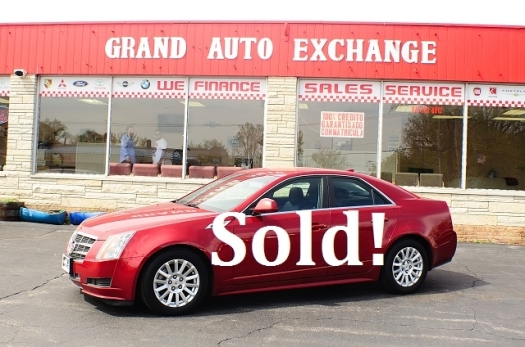
What’s the cost of all this fear? Lost sales. The B2B purchasing manager who has gotten used to buying all manner of products for themselves and others with a finger touch (and probably on their phone) knows that there’s a firm out there that has a site which will tell them the price. Of course, that site is also the one that has a ‘buy’ button so they can just get it now, not wait a few days to have a quote compiled, received, compared, agreements signed and so forth for an off-the-shelf-part.
Don’t believe me? Studies have shown 57% of the buying process is done prior to engaging with Sales – that’s before requesting a quote. That’s probably because 80% of companies implementing B2B e-commerce believe that their customer expectations have changed due to B2C practices.
Maybe the scariest fear should be the feeling of prospective buyers skipping over a quote site for the vendor where they can simply press ‘buy.’ What’s even scarier is that buyer will never find out a part is cheaper, faster to ship or better in some regard, the sale was passed over because there wasn’t a ‘buy’ button.