One of the big things I push when redesigning packaging, or for that matter, working on branding in general, is owning your brand’s color. I think that a lot of times, the concept is not as precient as it should be in the minds of clients. Somehow the concept is not clear.
The idea behind it is that a unique color that your company or line has, if used well, is just as powerful as a distinctive logo – if not more. To think about it, the reasons become apparent.
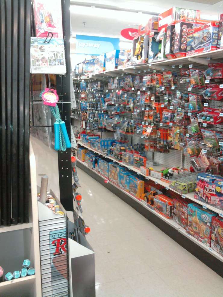
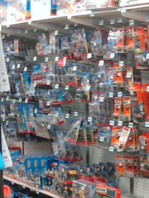
For a good example, I went to a store with my trusty, slightly blurry camera phone to illustrate. The branding we’re looking at is for Hot Wheels, the small toy cars.
Here is an image from down the main aisle. You can see the large swath of blue already. So you know that Hot Wheels are in that aisle even from this distance, which is quite far.
Being in the aisle, the color makes a distinctive break from it’s competitors. The blue has defined the Hot Wheels section.
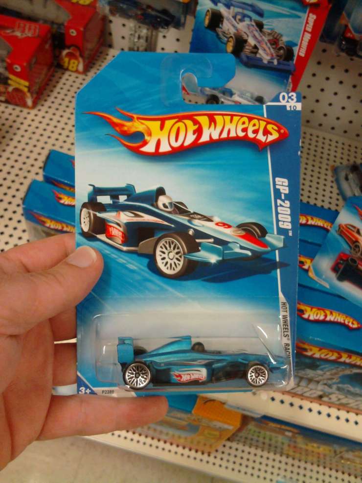
The packaging in hand shows that the blue is still the dominant color. The blue IS Hot Wheels, perhaps just as much as the logo.
So what does this all mean? In short, it means that your color defines your brand well before people can even make out your logo or the statements on the packaging or even the products contained within. If consumers know they want to buy your brand, they will find it faster with a well-played, consistent and distinctive color.
Color Branding has to come first when designing packaging lines – or any sort of client-facing items where competition happens. It is primary above marketing messaging or even logo work, otherwise your stuff gets lost in the chaff of everyone else.


One Reply to “”